
Pseudo Class - 가상 클래스
- html의 요소에서 특별한 상태를 명시할 때 사용한다.
- 선택자:가상클래스이름 {속성: 속성값;} 형식으로 사용한다.
 a:visited {
    color: red;
}

a:hover {
    color: blue;
    font-weight: 900px;
}
대표적으로 많이 쓰이는 가상 클래스
- :link - href 속성을 가진 a, area, link 중에 방문하지 않은 모든 요소를 선택한다.
- :visited - 사용자가 방문한 적이 있는 링크를 나타낸다.
- :active - 사용자가 활성화한 요소를 나타낸다(버튼 같은거)
- :hover - 사용자의 마우스 포인터가 요소위에 올라가 있으면 선택된다.
- :focus - 양식의 입력 칸 등 포커스를 받은 요소를 나타낸다. 보통 요소를 클릭, 탭 했을때 발동한다.
- :nth-child - 형제 사이에서의 순서에 따라 요소를 선택한다.
- :not(selector) - 안에 포함된 요소를 제외시킨다.
위의 가상 클래스를 사용할 때 link → visited → hover → active 순으로 선언하여 사용하길 권장한다.
순서가 달라지면 적용이 안될 수도 있기 때문이다.
Pseudo Element - 가상 요소
- html에서 요소의 특정 부분만을 선택할 때 사용한다.
- 선택자::가상요소이름 {속성: 속성값;} 형식으로 사용한다.
 /* 가상 요소 */
  .required::before {
    content: '*';
    margin-right: 2px;
    color: red;
    font-size: 18px;
  }
대표적인 가상 요소
- ::first-letter - 텍스트의 첫 글자만을 선택한다. - 단, block-level-element요소에서 사용할 수 있다.
- ::first-line - 텍스트의 첫 라인만을 선택한다. - 단, block-level-element요소에서 사용할 수 있다.
- ::before - 특정 요소의 내용 바로 앞에 다른 요소를 삽입할 때 사용한다.
- ::after - 특정 요소의 내용 바로 뒤에 다른 요소를 삽입할 때 사용한다.
- ::selection - 해당 요소에서 사용자가 선택한 부분만을 선택할 때 사용한다.
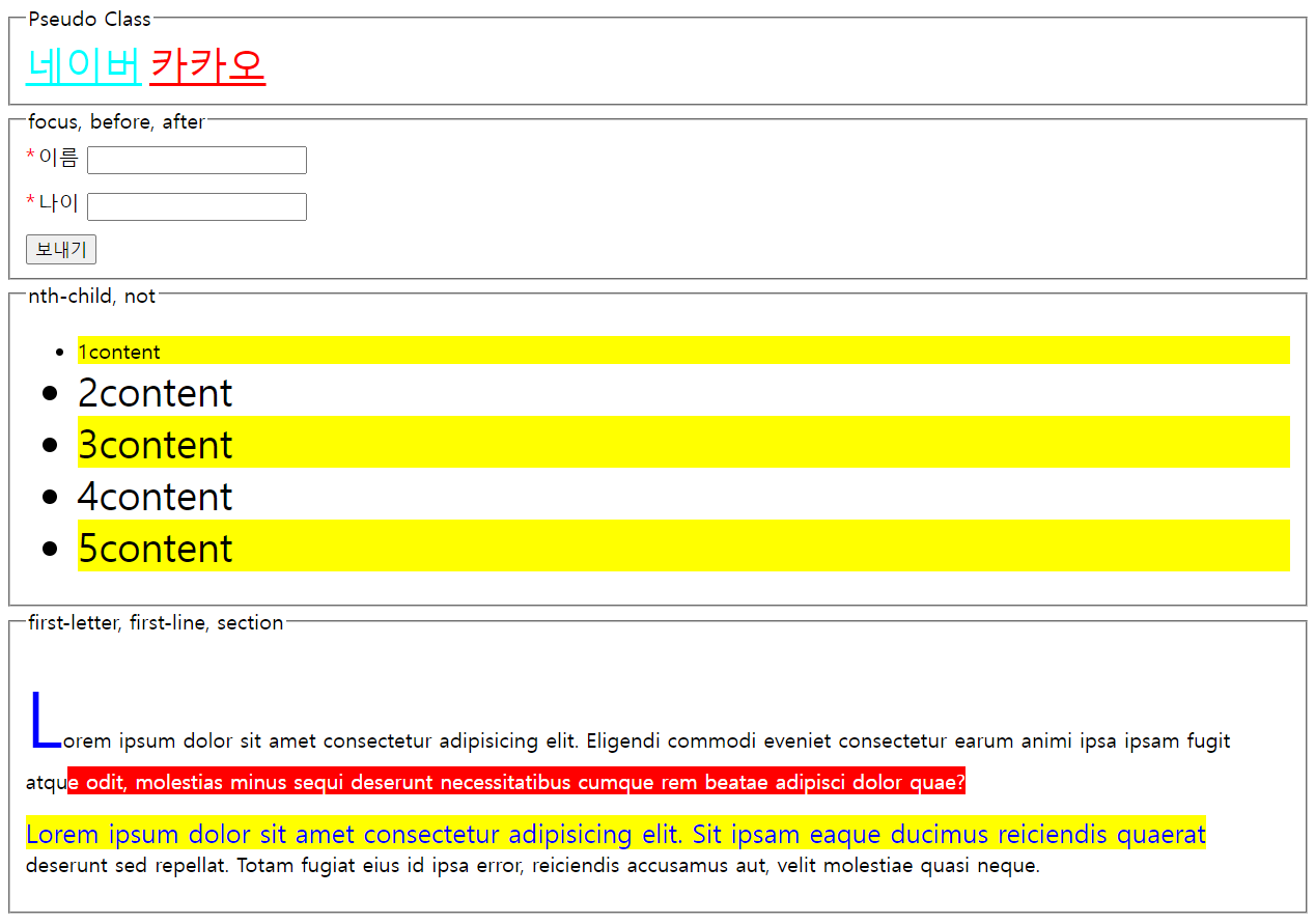
원본 코드
<!DOCTYPE html>
<html lang="en">
  <head>
    <meta charset="UTF-8" />
    <meta name="viewport" content="width=device-width, initial-scale=1.0" />
    <title>Pseudo Class & Element</title>
    <style>
      a {
        font-size: 30px;
      }
      a:link {
        color: cyan;
      }
      a:visited {
        color: red;
      }
      a:hover {
        color: blue;
        font-weight: 900px;
      }
      fieldset:hover {
        background-color: lightgray;
        box-shadow: 0 0 20px gray;
        transition: 0.3s; /* 애니메이션 효과 */
      }
      a:active {
        color: yellow;
      }
      input:focus {
        outline: none;
        border: 3px solid red;
        box-shadow: 0 0 20px rgb(206, 90, 90);
      }

      .field {
        margin-bottom: 10px;
      }
      li:nth-child(odd) {
        background-color: yellow;
      }
      li:not(.target) {
        font-size: 30px;
      }

      /* 가상 요소 */
      .required::before {
        content: '*';
        margin-right: 2px;
        color: red;
        font-size: 18px;
      }

      [data-tooltip] {
        position: relative;
      }

      [data-tooltip]:hover::after {
        content: attr(data-tooltip); /* 속성이 있는 값을 가져올때 사용한다 */
        position: absolute; /* 조상 태그중에 최상위 태그인 body에 영향을 받는다.*/
        top: 0px;
        left: 56px;
        background-color: black;
        color: white;
        width: 250px;
      }
      .letter::first-letter {
        font-size: 60px;
        color: blue;
      }
      .line::first-line {
        background-color: yellow;
        color: blue;
        font-size: 20px;
      }
      p::selection {
        background-color: red;
        color: white;
      }
    </style>
  </head>
  <body>
    <fieldset>
      <legend>Pseudo Class</legend>
      <div>
        <a href="http://naver.com">네이버</a>
        <a href="http://kakao.com">카카오</a>
      </div>
    </fieldset>
    <fieldset>
      <legend>focus, before, after</legend>
      <div class="field">
        <label class="required" for="name">이름</label>
        <input type="text" id="name" />
      </div>
      <div class="field">
        <label class="required" for="age">나이</label>
        <input type="text" id="age" />
      </div>
      <button data-tooltip="이 버튼을 클릭하여 정보를 보내세요">보내기</button>
    </fieldset>

    <fieldset>
      <legend>nth-child, not</legend>
      <ul>
        <li class="target">1content</li>
        <li>2content</li>
        <li>3content</li>
        <li>4content</li>
        <li>5content</li>
      </ul>
    </fieldset>

    <fieldset>
      <legend>first-letter, first-line, section</legend>
      <div>
        <p class="letter">
          Lorem ipsum dolor sit amet consectetur adipisicing elit. Eligendi
          commodi eveniet consectetur earum animi ipsa ipsam fugit atque odit,
          molestias minus sequi deserunt necessitatibus cumque rem beatae
          adipisci dolor quae?
        </p>
        <p class="line">
          Lorem ipsum dolor sit amet consectetur adipisicing elit. Sit ipsam
          eaque ducimus reiciendis quaerat deserunt sed repellat. Totam fugiat
          eius id ipsa error, reiciendis accusamus aut, velit molestiae quasi
          neque.
        </p>
      </div>
    </fieldset>
  </body>
</html>
참고한 사이트
https://www.youtube.com/@gymcoding
짐코딩 GYM CODING
【실전코딩 짐코딩 클럽 💪🏋️♀️】 👉 https://gymcoding.co (짐코딩 사이트, 강의교안 등등) 【짐코딩 클럽 온라인 강의 🎉】 👉 https://edu.gymcoding.co 👉 모든 유료강의 구독자 할인 쿠폰코드
www.youtube.com
https://developer.mozilla.org/en-US/docs/Web/CSS/:active
:active - CSS: Cascading Style Sheets | MDN
The :active CSS pseudo-class represents an element (such as a button) that is being activated by the user. When using a mouse, "activation" typically starts when the user presses down the primary mouse button.
developer.mozilla.org
'스터디일지 > CSS' 카테고리의 다른 글
| [CSS] 기본 익히기 PART 9 (0) | 2024.03.15 |
|---|---|
| [CSS] 기본 익히기 PART 8 (0) | 2024.03.15 |
| [CSS] 기본 익히기 PART 6 (0) | 2024.03.14 |
| [CSS] 기본 익히기 PART 5 (1) | 2024.03.14 |
| [CSS] 기본 익히기 PART 4 (0) | 2024.03.13 |


